Photo Session Style Guide
I’m so excited to be working with you and look forward to your upcoming session! Photos are always so meaningful, so I want you to have the best experience possible. This is a time for you to relax and enjoy yourself while I capture your family in a natural and authentic way. My hope is that this is a fun experience for you and your family and that we are able to capture some great moments!
I am often asked, “What should we wear?” and I totally get it! It can be a challenge to find outfits for everyone in the family that go well together and that your family will want to wear. This guide will help you prepare for your session and get the most out of our time together. I’ve included tips on what to wear, how to select and coordinate colors and patterns, and ways to add unique, meaningful touches to your images.
Keep in mind that these are all just ideas! You certainly do not have to implement ALL of them... or ANY of them for that matter! The most important thing is that your photos are a reflection of YOU. But, if you’re feeling stuck, or just need some inspiration, here are a few tips to guide you.
where to begin- start with you
Do you have a certain color that you really love to wear? Wear it! Do you love dresses? Wear one! Find something that makes you feel beautiful! If you are comfortable in what you are wearing, it will transfer to your photos. Being comfortable and confident in what we're wearing can make a huge difference in how we feel and how relaxed we are in front of the camera.
examples
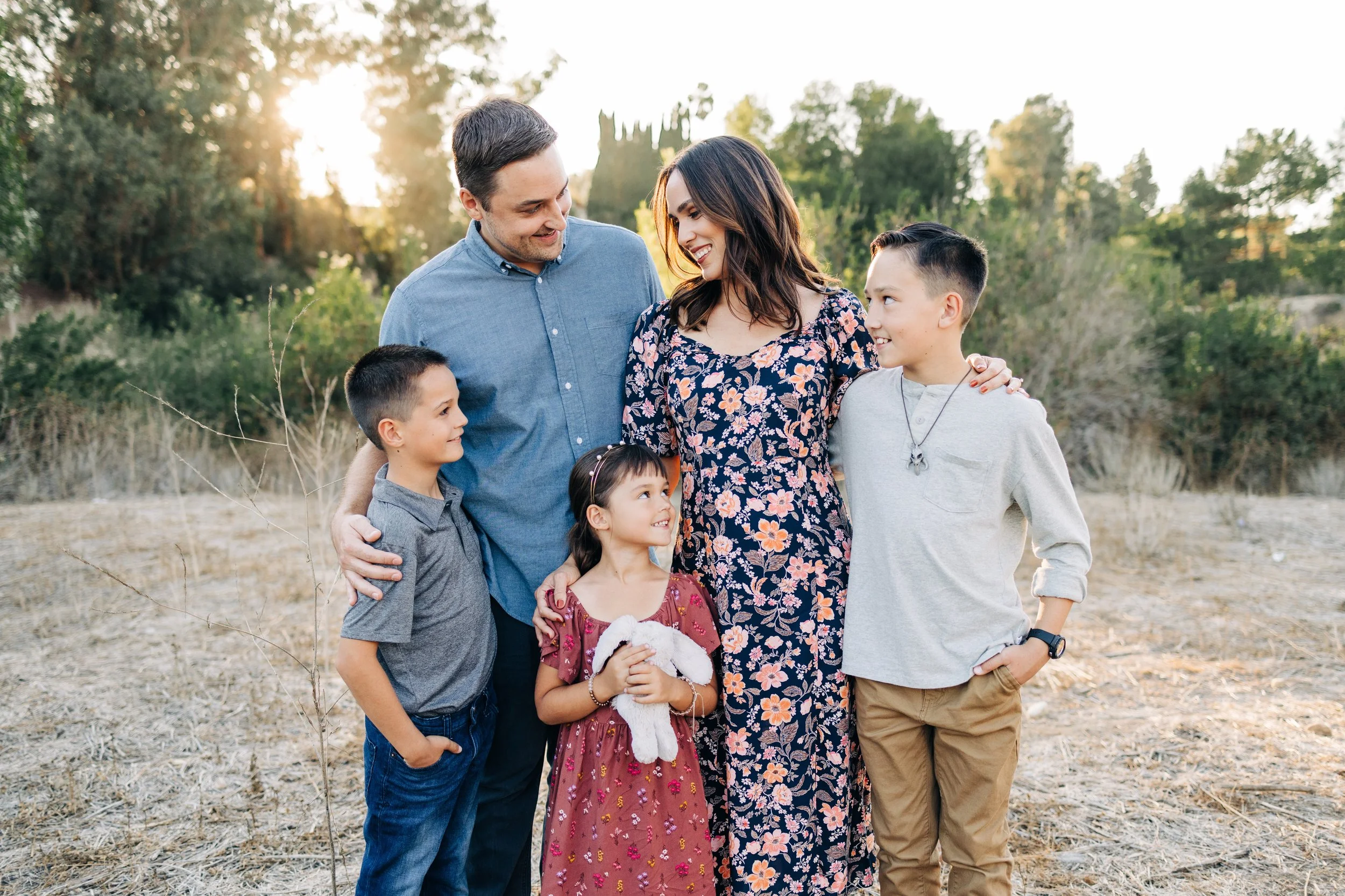
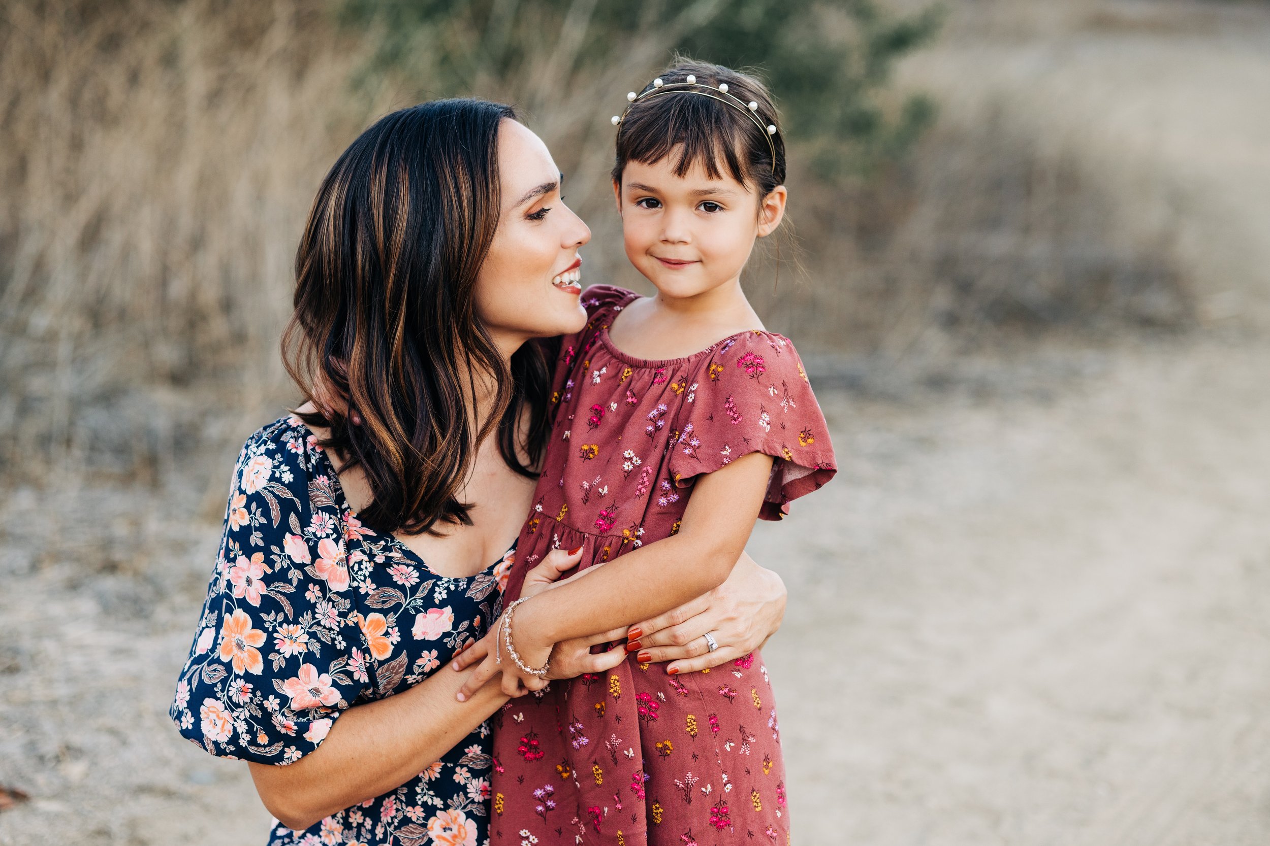
FOR MOM: Long dresses are the flattering and photograph beautifully. Dresses or skirts with movement add an extra touch of grace and elegance to your photos!
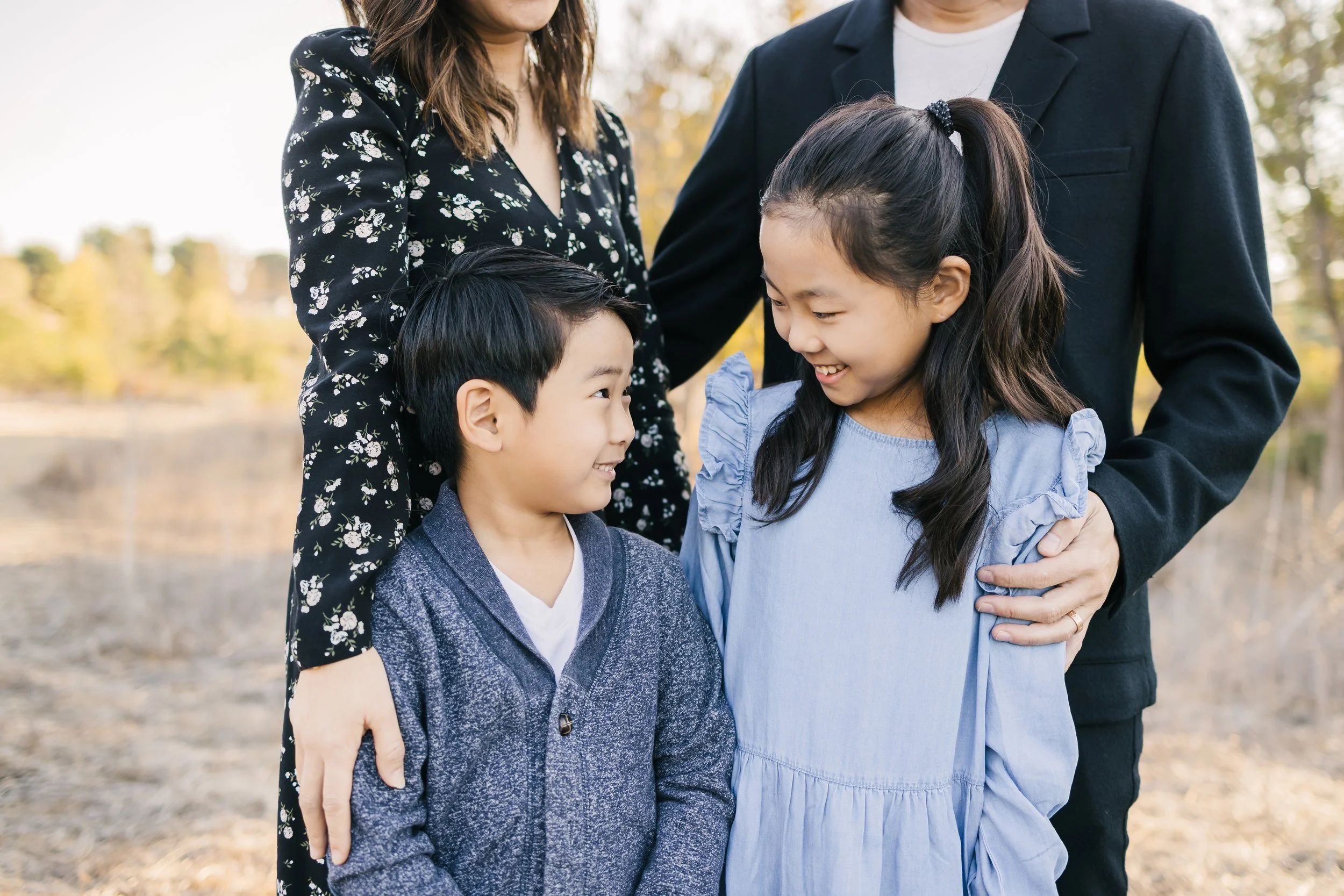
FOR DAD: Button up shirts or Henley's look sharp, masculine and tailored in photos. Keep in mind that fitted slacks, as opposed to cargo styles, photograph best.
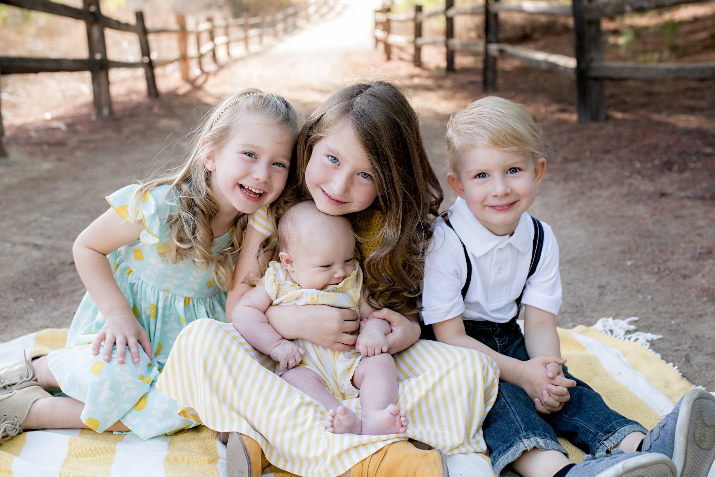
FOR KIDS: Same as mom and dad! Don’t forget to accessorize! Little touches like hair accessories, bow ties and suspenders can add the perfect touch to your photos.
coordinating vs matching
Coordinating colors are far better than matching in all the same color. Choose colors that look nice together, but don't fall into the trap that you all need to be wearing the exact same blue shirt. Your photos will be far more interesting with some variation! Add interest to your photos by incorporating plenty of color and/ or patterns. Don't be afraid of either of these! If you're overwhelmed with where to start, or wonder "How much is too much?" you might start with a print that you love, and pull in some of the coordinating colors with other pieces.
I always recommend having at least three colors in your palette. Adding in a couple of patterns looks nice too! Add in a solid shirt for one person, maybe some stripes for another. Remember, the key is to coordinate, so the colors in your prints and patterns are your friend! If you vary the size of pattern or stripe by person, they tend to coordinate better than all small patterns or all the same size stripes. Another tip is that tiny checkered prints tend to create a strange zigzag effect on photos. Larger checkered patterns are great!
If your personality is suited to a more subtle look, neutrals photograph beautifully as well. You can easily keep your color scheme neutral and add in smaller amounts of color for variety.
If you’re having a hard time deciding on a color palette, let the colors of your home inspire you! Since your home is where your images will be displayed, think about the colors that will coordinate well with your home and style of décor.
layers and accessories
Finish off your look with accessories and layers.This can really make your photos "YOU" and look fantastic in photos! Consider adding a statement necklace or scarf to your outfit, and for your family, consider accessories such as a vest, belt, jacket, hat, suspenders, headband, etc. Accessories are the perfect way to give a finishing touch to your look, and they can really set your photos apart.
Things to avoid
There are a few tones that are less flattering for photos, that I usually recommend my clients avoid, specifically neon colors and sometimes bright red. Neon colors will cast bright colors onto your skin in photos, and can make it difficult to capture your natural skin tones. As mentioned before, very small checkered patterns also do not photograph well as they can create a distortion on the clothing.